
Since 2016, for the first time ever, more surfing is done on mobile devices than via desktop. Google also announced at that time to give mobile traffic a higher priority in indexing for its search engine. And that’s exactly why it’s important for you to look into this properly. Google needs to keep you on your toes, after all, the search engine determines your ranking and so that is largely based on the mobile accessibility of your WordPress website.
In this blog, we explain to you what mobile first exactly what it means and how you can prepare for it.
What is mobile first indexing anyway?
In mobile first indexing, Google uses the mobile version of your WordPress website for indexing and ranking in the search engine. Previously, Google looked at the desktop version of your WordPress website, but as the percentage of mobile users continues to grow, the Google increasingly values mobile-friendly websites.
So what do we really mean by mobile-friendly?
A mobile-friendly website should provide an optimal user experience on smartphones and tablets. This means that the design of your website should be responsive, where the layout of the website adapts to the size of the screen on which the WordPress website is viewed. On a smartphone or tablet, the images and text will scale with you and you will see blocks below each other instead of side by side. Thus, the website is no longer exactly the same on a smaller screen as it is on a computer screen, but all texts are thus more readable and the white space is better distributed.
Requirements for a mobile-friendly website
A WordPress website should not only be responsive are also touch-friendly. That includes menu bars and call-to-action buttons are large enough so that the user is not constantly on the wrong element clicks. Surely a thumb is bigger than a mouse cursor. Also, it is important to take into account optimization of the loading time of the Website. Along the way, we do have to deal more often with not so good internet connection. Ensure a load time of no more than 2 seconds, otherwise chances are you’ll lose your visitor.
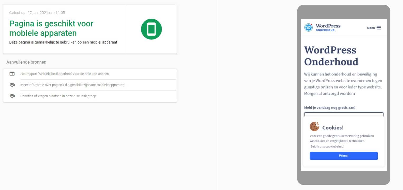
Is your WordPress website mobile-friendly?
Google offers a test to check whether your WordPress website is mobile-friendly though. This test indicates whether each page of your website is mobile-friendly and gives you advice if needed.
Enter your URL of the web page into https://search.google.com/test/mobile-friendly and take the test.
Is your website already mobile friendly? Beautiful! In case you haven’t already, we’ve made a few more tips for you.
Tips for a mobile-friendly website
Our WordPress specialists have pulled together some tips for you. These are useful tips to consider for your optimization. Are you curious about what we can do for you? Then take a look at our service WordPress Optimization.
A responsive WordPress theme
A major advantage of WordPress is that many themes are by themselves responsive. This means that your WordPress website will automatically display properly on a smartphone or tablet. Make sure Make sure your theme is completely up-to-date! If you don’t have your theme for a long time updated then it can still cause problems in the mobile view of your website.
Improve the load time of your WordPress website
Test your WordPress website using an online tool to find out if your website loads fast enough. The load time of your website is important to improve the online findability of your website. Google includes the speed at which a page loads in its ranking. Ways to improve load time are: optimize images, use caching and remove plugins. See here how you can make your WordPress website faster.
Use a plugin
A plugin can be an interim solution to Making your WordPress website responsive. The plugin recognizes whether the user is used a smartphone, tablet or computer and thus shows the right theme to the user. There are several plugins you can download for this purpose, there usually comes with a price tag.
Online success with mobile first
If you want to achieve online success then you must your focus on mobile first. The entire WordPress website should be focused on the mobile user. Look not only at the design, but also the structure of your website and the elements you use. Users navigate very differently on mobile devices than on the desktop. So optimize the user experience per device and check the analyses. These figures provide insight where little to no visitors come and where you lost the most visitors. This can All are related to the structure of your website that is not accessible for mobile.

More mobile users
As you probably understand by now, the answer to the question in the title is: yes! Mobile traffic dominates the online landscape and you can’t ignore that anymore. So prioritize mobile when it comes to your WordPress website. Even if you have the most beautiful website, if the user-friendliness is insufficient for a smartphone then all your work has been for nothing….
Contact us
Do you have a question about mobile first or are you failing to make your website properly responsive? Get in touch with our WordPress Experts. You can reach us by calling us at 030 20 72 488 or send a livechat. We have the knowledge and experience to make your website a success.